URL (Kinect/KinectJS Required): GestuRater
Features Added since Last Prototype
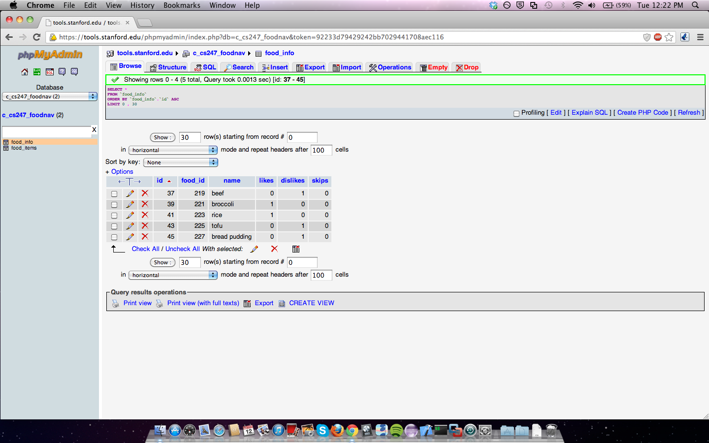
- Back end data collection: results are now recorded in a database so that administrators can see results of ratings
- Images move with user's hands: no longer use swiping motions as input, instead user has much greater control to move image into the correct category
- Holding images from moving before user's hand enters a certain threshold (for error-prevention)
- Summary of Ratings: each iteration through app shows an updated summary of ratings for the day, as well as what the current user voted on each category
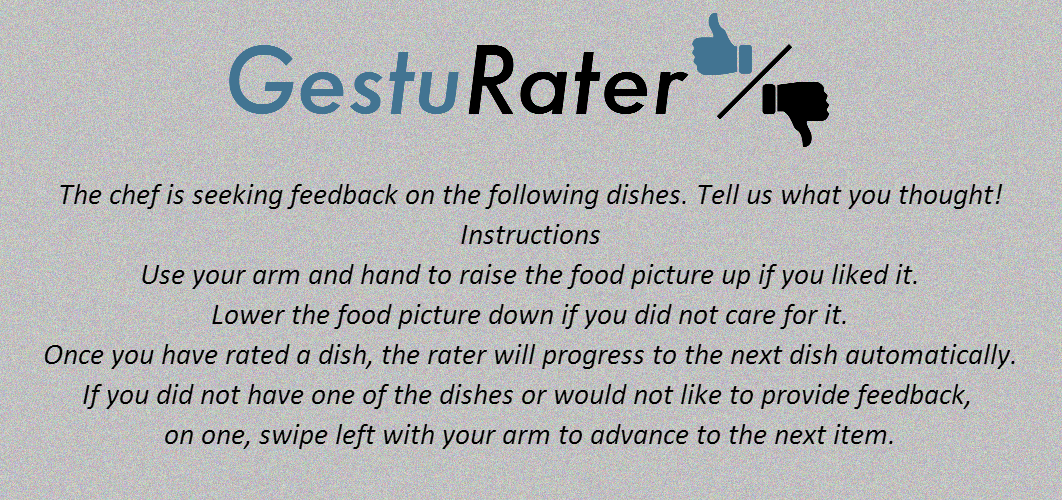
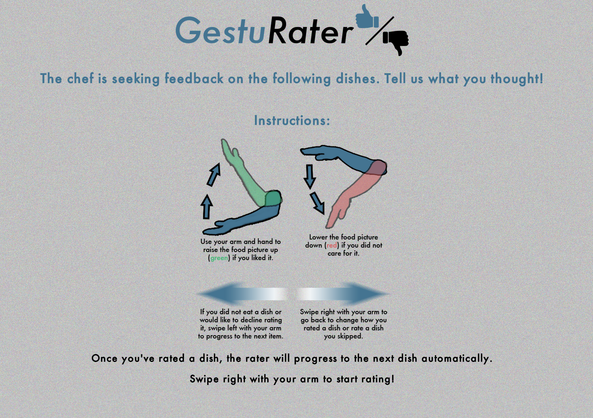
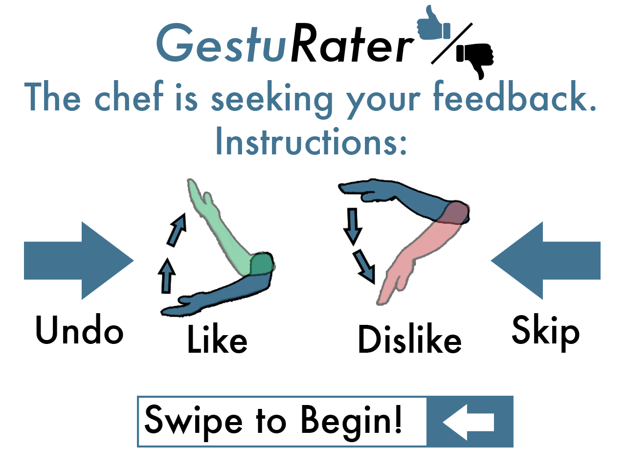
- Instructions page has been entirely redesigned for simple readability (added graphics to more clearly communicate expected gestures)
- User can navigate backwards and change their vote
- Image redrawing in red and green bars supports going backwards through the queue
- Thumbs up and thumbs down icons to increase clarity of absolute rating scale
The Process/Further Feature Details
Work on Functional Prototype 2 started before we had even finished testing Functional Prototype 1 in the first class period we were given to do so. We were given the immediate feedback that users
expected the capability to move backwards in the queue, and we quickly added it into the system midway through testing. We quickly discovered that users were struggling with our gestures and that
the Kinect was not recognizing them nearly as frequently as would be necessary for our application. So we knew that the first task we would have to tackle would be a complete redesign of the way
user’s rated an item. Rather than relying on dramatic swipes, we took a more subtle approach that enhanced user control. Images now move with a user’s hand in real time as they raise it up and down,
and once the image has breached a specific coordinate, the rating is registered as good or bad. While this had many issues that had to be hammered out (i.e. matching the geometry output by the Kinect
to that of the html canvas, limiting movement to the y-axis only, users holding their hand in one location so that rating kept constantly occurring in one spot without them meaning to, etc.), it was
absolutely a welcome change, and users seem to have taken to it easier than before.
During the first round of user testing we observed all 10 users who tested our system and wrote down our observations for further reference. By skimming through these observations and some videos, we
prioritized top new features/improvements in the system for the next iteration of GestuRater. (For specific information on user tests, see the User Testing page)
Features/Improvements
Speed: Many users felt that the system was very fast when moving to next image after rating a given image. This was making it difficult for users to understand and register
gestures for rating food items. To avoid this we introduced a time lag when moving to next food item rating from current food item. This time lag gives users enough time to reposition
their hand to rate the next food item and thus feel that things are in control while using the system.
Instructions Page: Almost all users were having a hard time reading the instructions page because a) font was small b) instructions were long and wordy c) icons for explaining
gestures were not very intuitive d) there was no gesture icon for “what to do to begin”? which left the users staring at the system. In the new iteration we have completely revamped
the instructions page. We have reduced the wordy sentences to just a few words or 1 word in some cases for explaining gestures. This helped in having a bigger font size for
instructions and users can read content with a lot of ease now. Also as mentioned earlier, after reading all instructions many users were clueless in which direction to swipe to start
rating food. To address this we have added a statement in big font in the end saying Swipe to begin with a an image showing which direction to swipe in.
Keeping Track of User Ratings: We observed that users felt slightly disoriented that a food item just disappeared completely after rating it as good or bad. Hence we have
made changes to show small resized images of food items in good/bad (green/red) sections of the screen on top and bottom of the main canvas.
Icons for Good/Bad Area: Just so that users don’t get confused we are now displaying a thumbs up in green area (good food items’ area) and a thumbs down in the red area
(bad food area). We believe this will serve as a good visual aid for users while rating food items.
Statistics Page: We received input from some users, TAs and our coach to try and slightly gamify the application. We asked some users if they would like to see a
summary page in the end with percentage of votes received by each food item. Most of the users felt it would be interesting and exciting to see what their friends are thinking
about food in the dining hall and seeing a summary view of all ratings would be great. We have implemented this in our system now. We are recording all user ratings and in database
and displaying those visually when a user is done rating food.
Resizing of Images: When a particular food item is being rated and is classified as good/bad the image was being resized to a very small size to fit the green/red
areas. To make this transition look smoother we have made changes to gradually reduce the size of the image.