Milestone 2: Wizard of Oz Testing
Prototypes
|
Prototype 1
|
|
Prototype 2
|
|
Prototype 3
|
More Bodystorming and Wizard of Oz Prototype Development
Before we developed our Wizard of Oz prototypes, we did some more bodystorming, to all get on the same page about how our product might work. This also brought to light several places where we disagreed. We used those disagreements to fuel different versions of the app for Wizard of Oz testing.
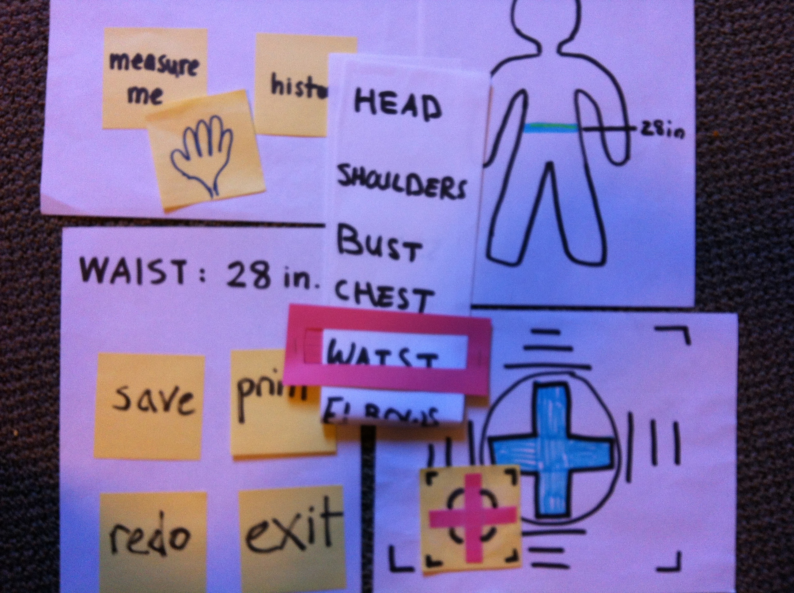
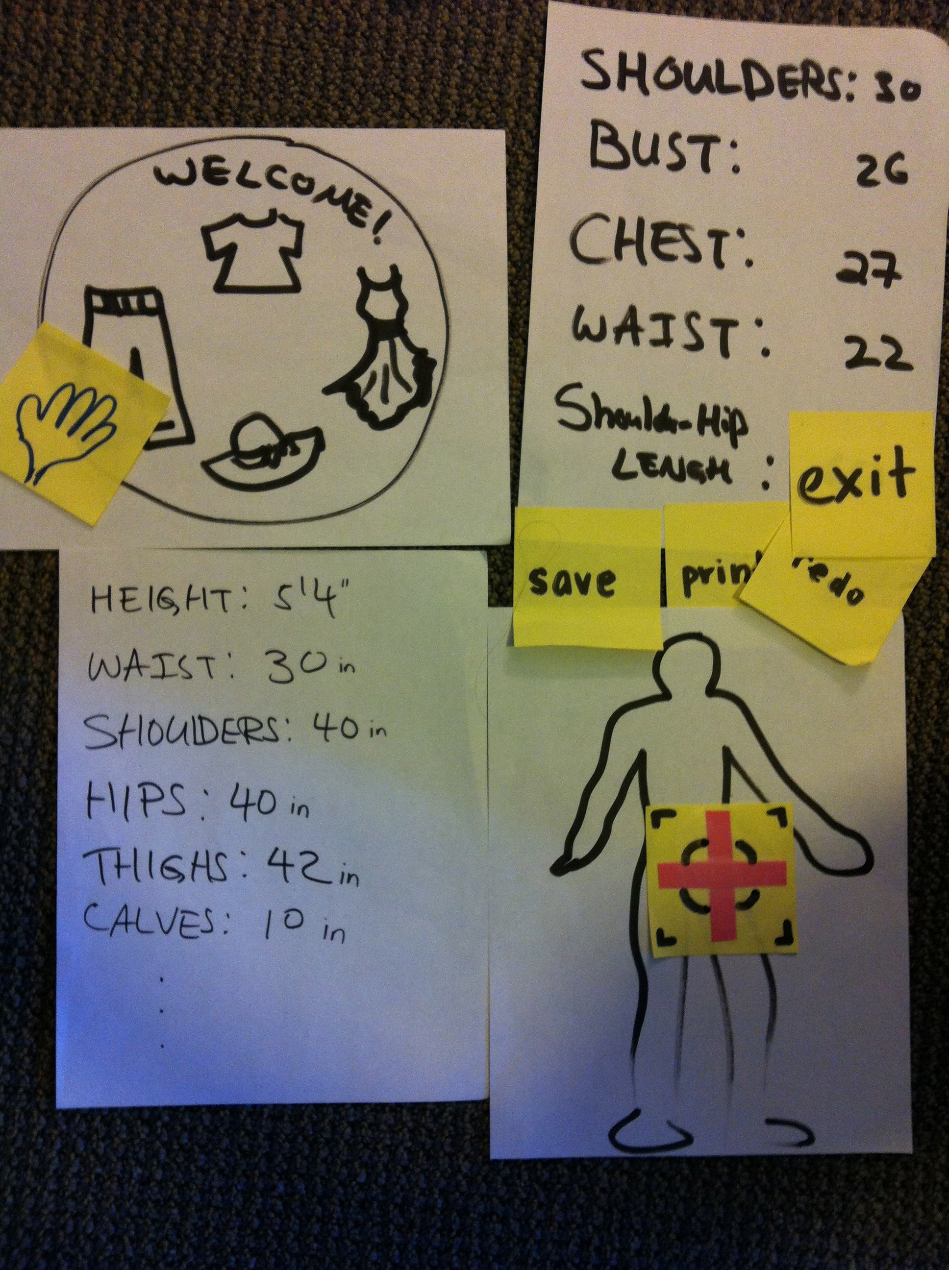
We started out with two different versions of the app. One let users select different body parts to measure, whereas the other had users select a different clothing type, and then returned all the relevant measurements for that clothing item. They each had a number of diffferent UI features as well.
Testing
We told users the bare minimum--that we had developed an app that would measure different parts of their body, and we told them to measure their waist size. We felt that this was a good exercise that would be representative of users of our app, because waist size is necessary for determining if pants and dresses will fit well. We felt it was a good representative of what people would want to measure. We sometimes phrased it as "You're buying a new pair of pants and don't know your size," and let them figure out what to measure, in order to be more representative of how they might actually use the app.
Data Collection
We observed people using the system and noted issues that they had problems with. We also asked them questions after the fact.
Both prototypes required users to align themselves with the system, which they found very confusing, and may not even be necessary. We will definitely get rid of this requirement if feasibility testing shows that we can.
There seemed to be a desire among users of the system that getting more measurements at once would be preferable to getting each measurement individually. The idea of a measurement "ID card" was thrown around--if getting multiple measurements at a time is not more technically challenging or time consuming, the system could get all the measurements at once, which the user could use for an online size chart or also to bring with them to a store.
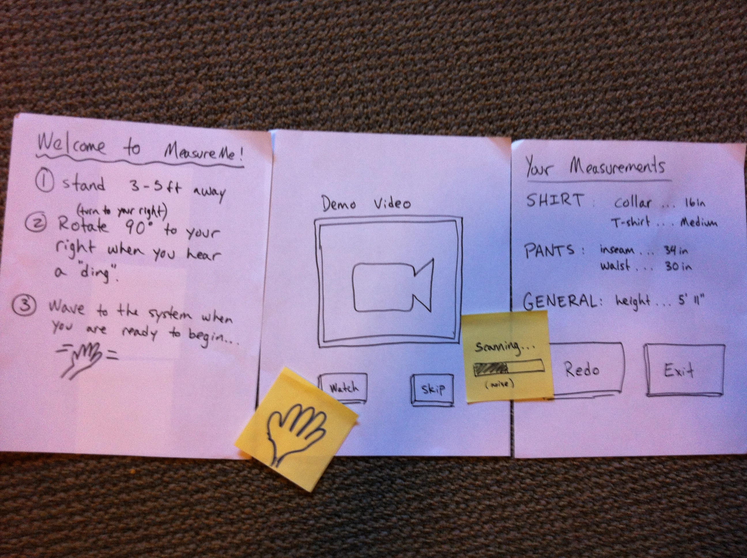
People were confused about how fast they should rotate and in which direction. They also didn't know when to start or stop turning. They needed some sort of audio cues, especially when their backs were turned to the system.
We found a number of usability bugs. Given our lack of previous experience with the Kinect, were were unaware of conventions of button pressing, so a few of our users became confused as to how to use our buttons, because we were waiting for them to make a pushing gesture.
We also learned that the instructions for how were were going to collect our measurements were unclear and at times out of order. When we started testing an instruction page, and then a demo video, much of their confusion was alleviated.
Some users were concerned that they would need to strip down to use our system, since baggy clothing could interfere with the accuracy of the measurements. Our instructions gave no instruction to this effect, but in reality we probably would need them to remove any baggy clothes before using the system.
Aspects of our design that our testers liked or found helpful included showing the point cloud of the user on the screen. The direct manipulation of the shadow on the screen helped users see what the Kinect would actually be looking at. Our testers also liked that we gave audio feedback while scanning, so that they knew something was happening while they were turned away.
We made our best attempt to rework some of the prototypes along the way, given the feedback we were getting. The most salient features that we redesigned were the instructional aspects of our app--providing written instructions and a demo video. We also provided some more system feedback, such a progress bar and audio cues that scanning was in progress. We plan to keep these, moving forward.
We need to do some feasibility testing to determine which parts of our system will be technically necessary. We'll also need to do more user testing to figure out the most natural way to get measurements--should users select body parts, clothing types, or nothing at all? All have pros and cons, but we didn't get any definite feedback from Wizard of Oz testing that would sway our decision one way or the other at this time.